01 / System scale
Building a scalable component foundation
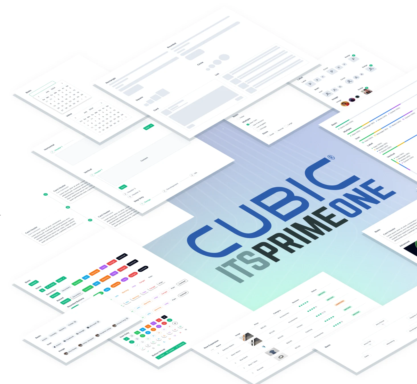
The Cubic ITS Platform Design System standardized PrimeNG components, custom components, brand colors, theme support, icons, and reusable interaction patterns across ITS applications.
94 PrimeNG components
The framework foundation for the system.
19 core components · 5 custom components
A combination of established and purpose-built components.
78 components in use
The component footprint recorded in the case-study snapshot.
20 button variants · 12 color families
Reusable visual and interaction standards.
33 custom icons
A consistent icon vocabulary for ITS applications.
73 components using Roboto
Typography alignment across the component library.
At the time of the case-study snapshot, Phase 1 enhancements were 98% complete and on target. This phase covered size unification, color assignments, border color assignments, and font assignments.
02 / Problem + opportunity
Adapting PrimeNG into a branded ITS design system
Development teams were already using PrimeNG. The work therefore focused on building Cubic ITS standards around that framework: preserving out-of-the-box behavior where possible, customizing where needed, and documenting decisions for consistent design-to-development use.
Framework foundation
The design system needed to align with the real components developers were already using.
Brand alignment
Components were adapted to Cubic corporate color, typography, iconography, and interaction standards without unnecessary customization.
Theme support
Light and dark themes required coordinated surface, border, text, color, and state decisions across PrimeNG-based components.
Developer-ready standards
Decisions needed to translate into Figma variables, token values, component documentation, and implementation-ready guidance.
The opportunity was to create a shared design-development system around PrimeNG that was branded, themeable, scalable, and practical to implement.
03 / My role + value
Design system modernization partner
I helped define component behavior, visual standards, token structure, documentation, and design-to-development handoff. I worked from PrimeNG foundations, Cubic brand standards, stakeholder feedback, and UX best practices to help create a more consistent, themeable, developer-ready ITS design system.
Component design
Built and refined Figma components, variants, states, and reusable interaction patterns.
Token strategy
Documented color, spacing, border, typography, and state values for design-development alignment.
Standards documentation
Created usage guidance for components, themes, icons, tables, forms, buttons, panels, drawers, and alerts.
Team alignment
Balanced PrimeNG behavior, Cubic brand direction, stakeholder feedback, and practical UX guidance.
My contribution was turning design-system decisions into reusable patterns, documented standards, and implementation-ready guidance. Focus areas included component variants and states, light and dark theme support, token and variable documentation, and developer handoff standards.
04 / Token + handoff
Creating a token-based, developer-ready design system
The ITS design system translated Cubic brand decisions, PrimeNG customization, theme behavior, and component states into reusable variables, token documentation, and implementation-ready standards.
Token Studio foundation
Token Studio helped establish the initial token structure for colors, spacing, borders, typography, and component states.
Figma Variables migration
As the system grew, Figma Variables became a more maintainable way for the team to manage light and dark theme values directly in Figma.
A shared reference
Token names, variable values, component states, and documentation connected designers and developers implementing PrimeNG-based components.
Define → document → implement
Map brand and component decisions to reusable token categories; record values, states, naming conventions, and usage guidance; support consistent PrimeNG customization, theme switching, and reusable component behavior.
Tokenization and documentation turned visual standards into a reusable design-development system that teams could understand, maintain, and implement consistently.
05 / Color + theme strategy
Supporting Cubic brand standards across light and dark themes
The color system translated Cubic corporate standards into reusable theme values for surfaces, borders, text, component states, alerts, and application UI.
Brand color alignment
Cubic primary blue, grays, and supporting colors were standardized across ITS applications.
Light / dark mode support
Theme values were structured so components could switch between visual modes consistently.
Accessibility and hierarchy
Surface, text, border, alert, and state colors needed to preserve readability and UI hierarchy.
06 / Component deep dive
Standardizing dense enterprise data tables
Tables required consistent headers, row density, hover states, selected states, footers, action areas, and theme-aware behavior for high-volume ITS workflows.
Data density
Table sizes supported different information-density needs across ITS applications without forcing one layout for every workflow.
Interaction states
Idle, hover, selected, disabled, and action states were documented so users could understand table behavior consistently.
Reusable implementation
Headers, footers, row spacing, icons, tags, ratings, and action areas were standardized for repeatable design and development use.
Tables brought typography, spacing, borders, icons, actions, selection, status, density, and theme behavior together in one reusable pattern.
07 / Component deep dive
Documenting reusable interaction states
Forms, buttons, alerts, dropdowns, and dialogs were standardized with variants, states, validation, severity colors, and theme-aware behavior.
Form states
Default, filled, invalid, disabled, help text, icons, select, date picker, checkbox, and radio states.
Button variants
Primary, secondary, outlined, icon-only, severity, grouped, select, toggle, disabled, and size variants.
Alert patterns
Success, info, warning, error, secondary, contrast, toast, and dialog patterns.
State consistency
Documented visual states supported predictable behavior across components.
08 / What this work demonstrates
A scalable system that teams can build from
This project demonstrates my ability to modernize an existing component framework into a scalable, token-based design system by aligning brand standards, theme behavior, reusable components, documentation, and developer-ready implementation guidance.
Framework-based design-system architecture
Built standards around PrimeNG foundations, customizing only where needed for Cubic brand, UX, and implementation requirements.
Token and variable governance
Created a reusable design-development language through documented colors, spacing, borders, typography, states, and Figma variable structure.
Themeable component system
Supported light and dark modes through coordinated surface, text, border, state, alert, and component values.
Design-to-development alignment
Connected UX decisions, stakeholder feedback, component documentation, and developer handoff into standards teams could reuse.
This work reduced one-off UI decisions and turned external library foundations, brand requirements, and component usage into a scalable enterprise design system that teams could understand, maintain, and build from.