01 / OVERVIEW
MOBILE PRODUCT DESIGN
RentalHQ Mobile
Designing one financial product architecture for native Android and iOS experiences.
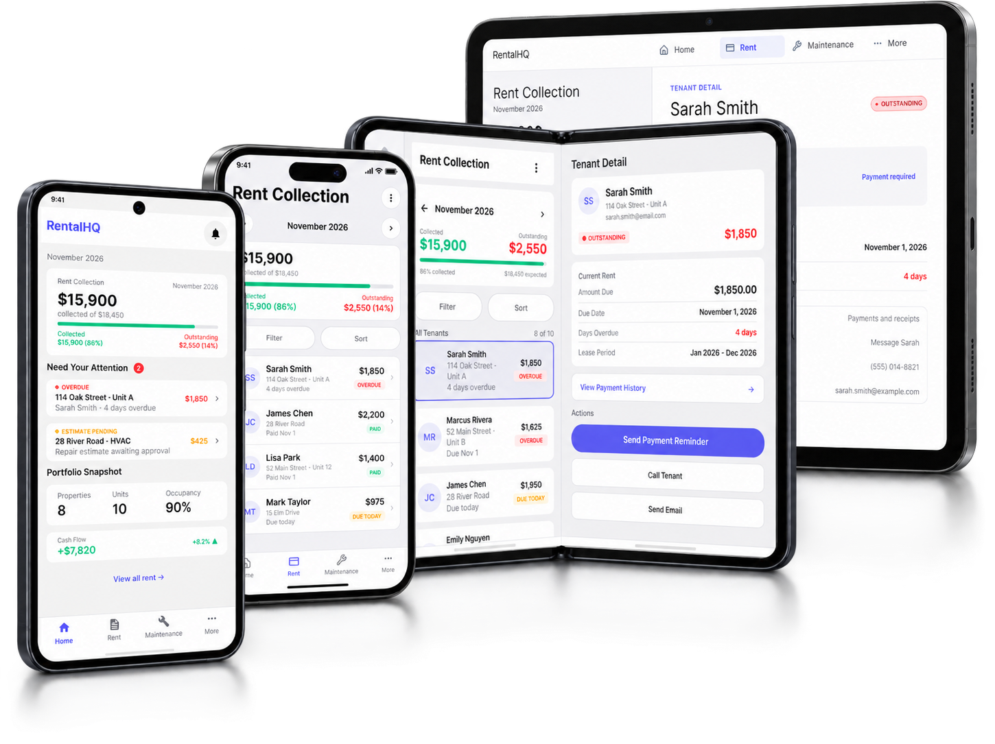
RentalHQ is a property-operations platform for independent landlords managing rent, tenants, maintenance, documents, and portfolio performance.
The mobile experience reframes that broader operating system around the decisions landlords need to make away from their desk: understand financial state, identify exceptions, investigate context, and take the next useful action.
Business logic, task structure, and financial meaning stay consistent across platforms while Android and iOS follow their own native interaction conventions.
SHARED PRODUCT PRINCIPLE
One product model.
Two native interaction systems.
02 / PRODUCT CONTEXT
One product architecture across desktop and mobile.
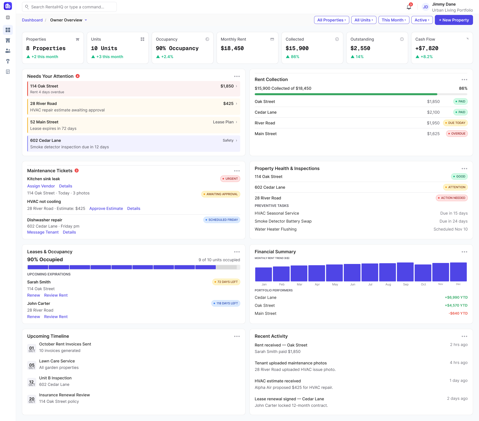
RentalHQ supports landlords managing the financial and operational reality of their properties: rent collection, tenant activity, maintenance, documents, and portfolio performance.
The desktop product acts as an operating environment for reviewing portfolio health, investigating issues, and managing work across properties.
The mobile product needed to preserve that same product model while prioritizing immediate financial awareness, exception handling, and task action.
01
TARGET USER
Independent landlords and small property investors managing 2–50 rental units, with a core sweet spot around smaller self-managed portfolios.
02
CORE NEED
Achieve fast situational awareness: understand what needs attention, what is financially exposed, and what action comes next.
03
PRODUCT VALUE
Unify properties, tenants, leases, rent, maintenance, documents, and financial signals into one connected operating model.
04
MOBILE OPPORTUNITY
Prioritize high-frequency financial awareness, exception handling, and focused follow-through away from the desk.
PRODUCT PRINCIPLE
Everything happening in the property business should be understandable as one connected system — not a collection of disconnected tools.
03 / MOBILE REFRAMING
Desktop is a command center. Mobile is an action surface.
The mobile experience was not a reduced desktop interface. It was a reframing of the same product architecture around the decisions and actions that matter away from the desk.
Desktop supports broad review, comparison, investigation, and management across a portfolio. Mobile supports fast understanding, exception awareness, and focused follow-through.
The product model stays shared. The information hierarchy, interaction patterns, and screen composition adapt to the usage context.
DESKTOP
COMMAND CENTER
- Portfolio-wide visibility
- Detailed review and comparison
- Multiple tools and data views
- Longer management workflows
MOBILE
ACTION SURFACE
- Immediate financial state
- Exceptions and priorities
- Focused task completion
- Quick access to relevant context
Mobile screens begin with the questions that help a landlord understand what matters now.
Material 3
Apple HIG
Financial State First
Surface the financial condition of the portfolio before deeper detail.
Exceptions in Context
Make outstanding rent, tasks, and operational signals visible with relevant context.
Native Interaction Systems
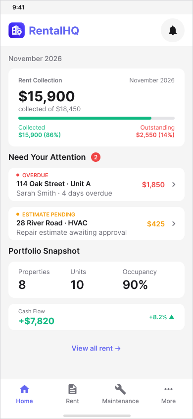
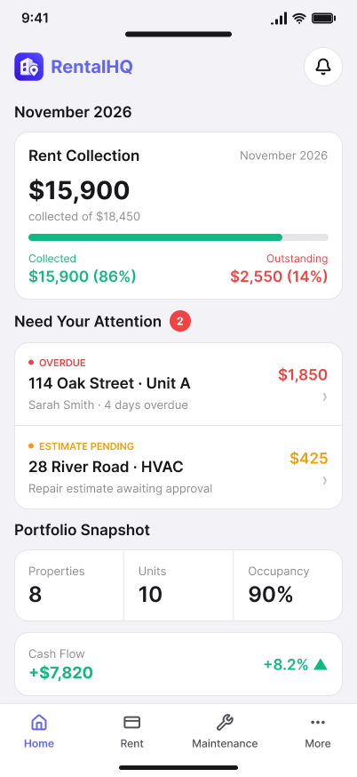
Keep the shared product model while using Android Material 3 and Apple HIG conventions.
REFRAME, DON’T SHRINK
Mobile is a different usage context — not a reduced desktop viewport.
04 / MY ROLE
Designing the system between product behavior and platform behavior.
The work extended beyond producing separate Android and iOS screens.
As Product Owner / UX Lead, I defined the connective layer between RentalHQ’s shared product model and the native interaction systems used to express it — preserving workflow, financial meaning, and task continuity while allowing each platform to behave like itself.
01 / PRODUCT ARCHITECTURE
Translate the broader product model into mobile behavior.
Carry financial state, task relationships, and business rules from the larger RentalHQ system into a focused mobile product structure.
02 / MOBILE INFORMATION ARCHITECTURE
Prioritize what matters away from the desk.
Reorganize dense desktop information around financial awareness, exceptions, focused decisions, and progressive detail.
03 / CROSS-PLATFORM UX
Preserve product parity without forcing UI parity.
Keep workflow, data, terminology, and state meaning consistent while allowing Android and iOS to use their own native interaction conventions.
04 / INTERACTION DESIGN
Define how decisions and state changes behave.
Establish navigation, selection, filtering, modality, validation, confirmation, feedback, and recovery patterns across key mobile workflows.
05 / ADAPTIVE UX
Change density without breaking task continuity.
Adapt the experience across compact, landscape, medium, expanded, and regular-width environments while preserving the user’s current task and context.
06 / DESIGN → DEVELOPMENT
Create a shared behavioral contract for implementation.
Define what must remain consistent across platforms so Android and iOS teams can implement native components without fragmenting product behavior.
LEADERSHIP PRINCIPLE
Cross-platform consistency should be governed at the behavioral layer before it is expressed at the component layer.
05 / SHARED PRODUCT ARCHITECTURE
Shared Product Architecture
The product architecture stays shared across platforms while native navigation and interaction systems adapt to the patterns Android and iOS users already understand.

Home
Portfolio, cash flow, alerts

Rent
Collections, tenants, payments

Maintenance
Issues, expenses, vendors

More
Settings and support
 Home ContentPortfolio, cash flow, alerts
 Overdue RentPayment alert
 Maintenance IssueOpen request
 Tenant DetailTenant / rent status
 Expense ReviewReview / approve
 Rent CollectionTenant list / payment status
 Tenant ListFilter / sort
 Tenant DetailTenant / payment actions
 Payment HistoryRecords / receipts
 Send ReminderReminder / follow-up
 Reminder ConfirmationReminder sent
 Updated Follow-UpFollow-up recorded
 Maintenance ListStatus / priority / vendor
 Maintenance DetailRequest status
 Expense ReviewReview / approve
 Expense ApprovalApprove
 Cash Flow ImpactFinancial impact
 SettingsPreferences / notifications
 ReportsReports / exports
 AccountProfile / sign out
Native Platform Expression

Android
Material Design 3
 Bottom navigation — Primary destinations
 Top app bar — Context & actions
 Bottom sheets — Temporary tasks
 Dialogs — Feedback & confirmation
 System back navigation — Android back behavior
iOS
Apple Human Interface Guidelines
 Tab bar — Primary destinations
 Navigation bar — Context & actions
 Native sheets — Temporary tasks
 Alerts — Feedback & confirmation
 System navigation — iOS navigation behavior
Shared Cross-Platform Principles
Consistent Architecture
Core tasks stay consistent across platforms.
Same Financial Meaning
Payment and cash-flow states remain unchanged.
Platform-Native Experience
Navigation and temporary surfaces follow native conventions.
Task Continuity
Context is preserved as layouts adapt.
06 / FINANCIAL HOME
Financial health first. Exceptions before detail.
The financial home prioritizes the information that helps a landlord understand the health of the portfolio and decide what needs attention next.
The hierarchy is shared even when each platform expresses it through different native spacing, navigation, grouping, and controls.
01 / COLLECTION HEALTH
Collection health establishes the financial condition first.
Collected and outstanding rent provide the primary financial signal, giving the user a clear view of portfolio health before attention shifts to exceptions or broader context.
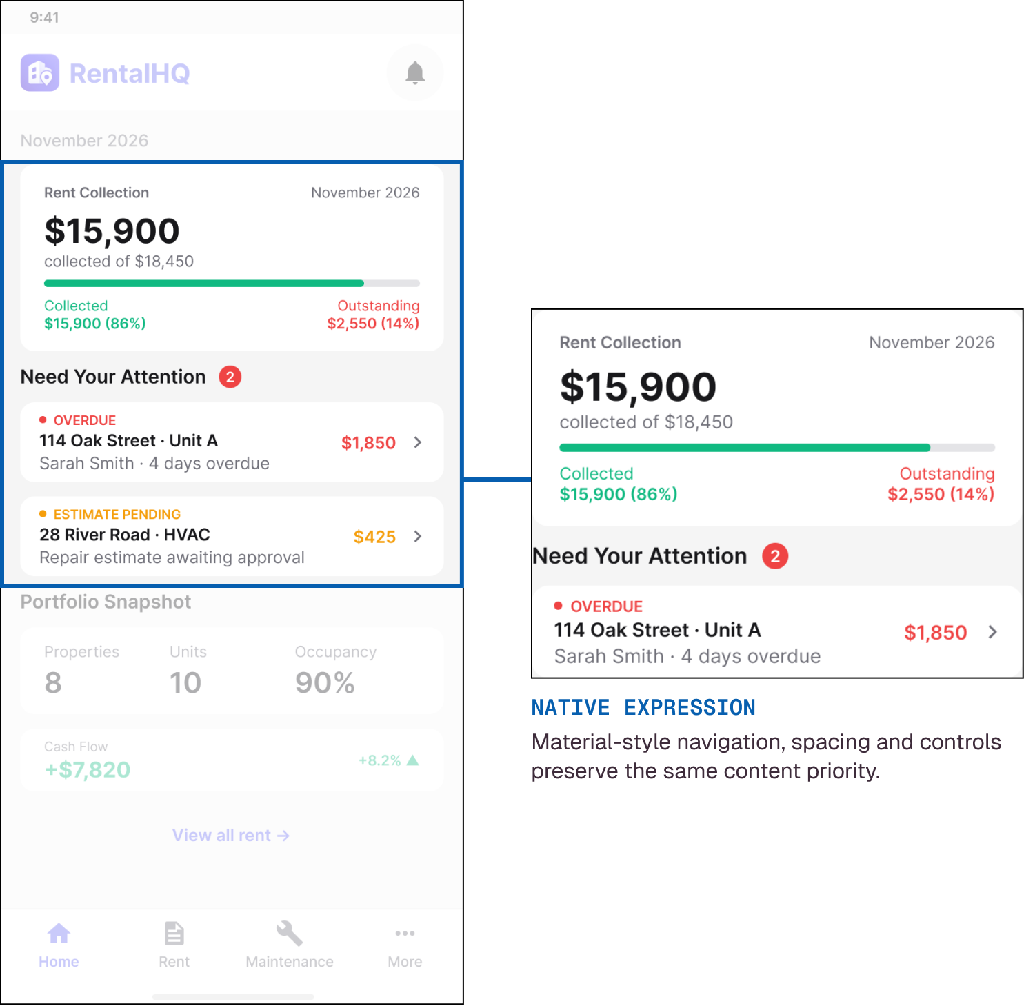
Material Design 3
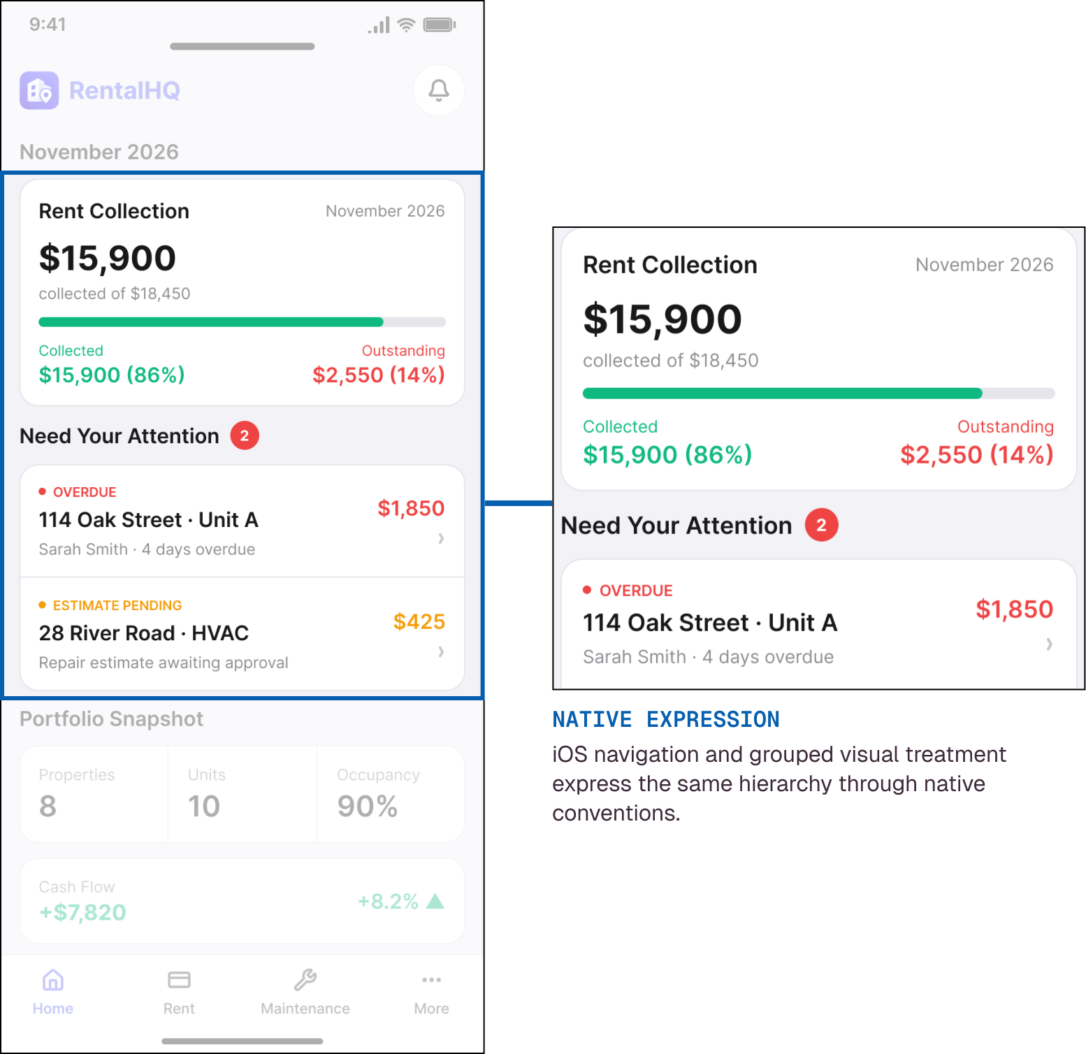
Apple Human Interface Guidelines
02 / EXCEPTIONS
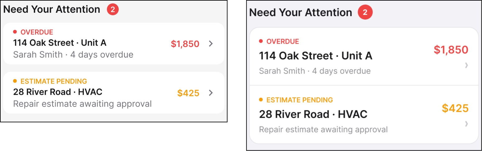
Exceptions become actionable when financial state is already understood.
Overdue rent and pending maintenance costs rise immediately after collection health, carrying enough property, tenant, amount, and status context to support the next decision.
Material Design 3
Apple Human Interface Guidelines
03 / PORTFOLIO CONTEXT
Broader context supports the decision without displacing priority.
Occupancy, property count, tenant context, and cash flow remain available after the immediate financial condition and urgent exceptions are understood.
Material Design 3
Apple Human Interface Guidelines
FINANCIAL HOME PRINCIPLE
The product does not need identical screens to preserve identical financial meaning.
07 / RENT COLLECTION JOURNEY
One shared workflow from financial awareness to accurate follow-up.
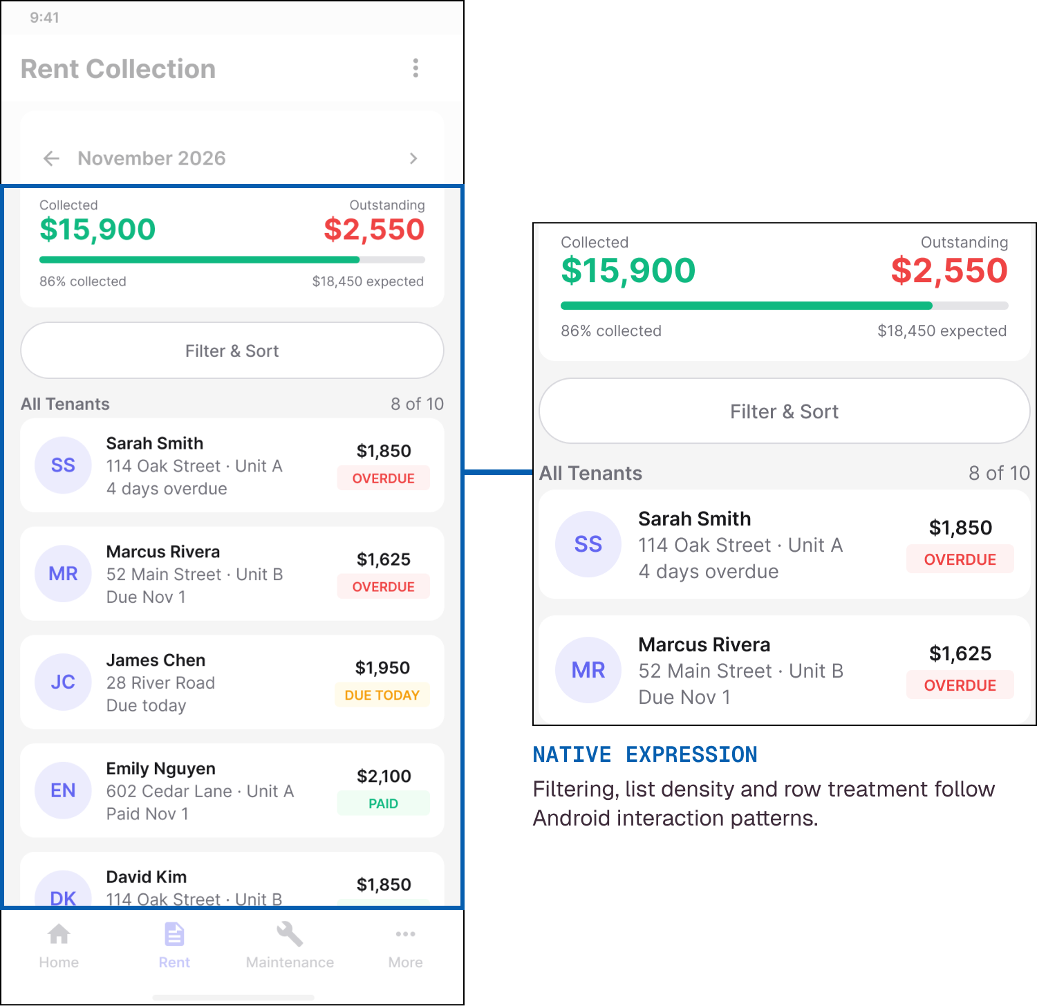
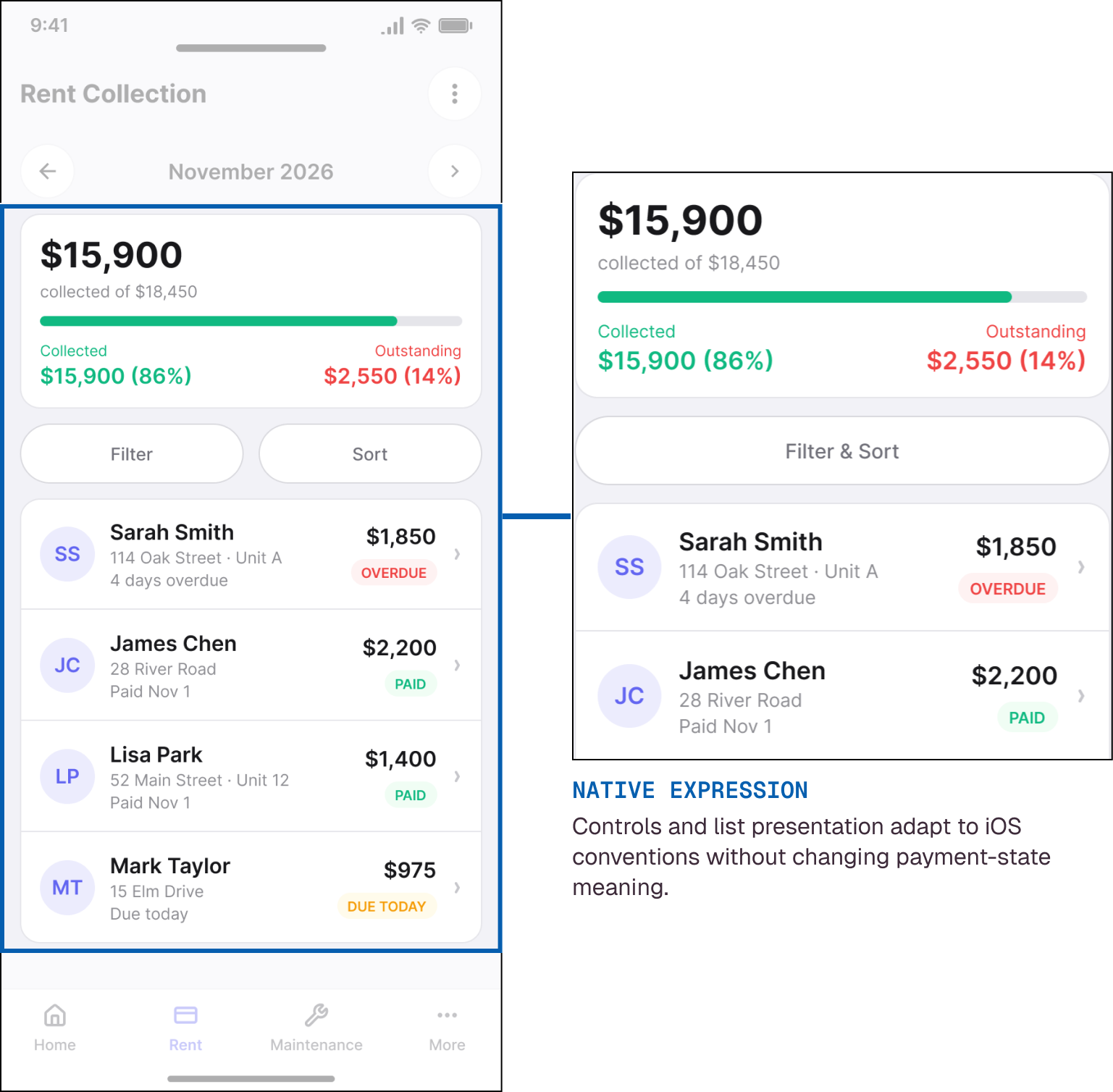
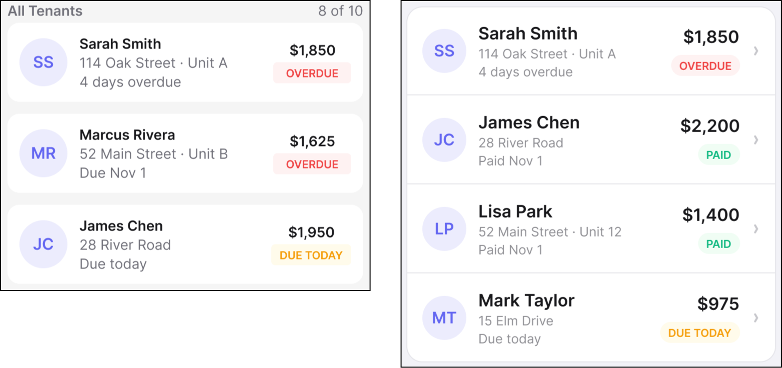
Rent collection is more than a payment list. The mobile workflow has to help a landlord recognize an issue, identify the tenant, investigate the financial context, take action, confirm the result, and return to an updated state.
Android and iOS preserve that business sequence even when navigation, controls, temporary surfaces, and interaction patterns adapt to each platform.
01
UNDERSTAND
View the Home financial state and attention items to understand what requires action.
02
IDENTIFY
Open Rent Collection and identify the overdue tenant or payment exception.
03
INVESTIGATE
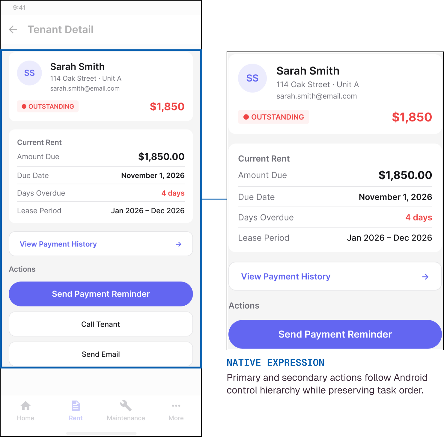
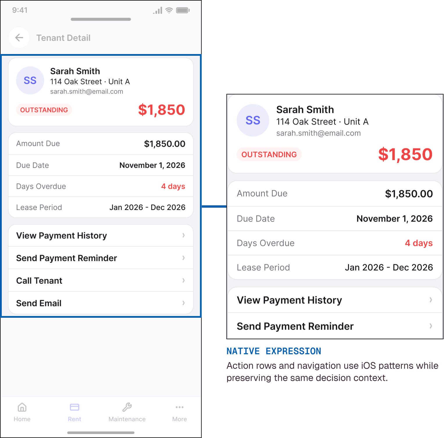
Open the tenant record and review balance, due date, overdue state, payment history, and relevant context before taking action.
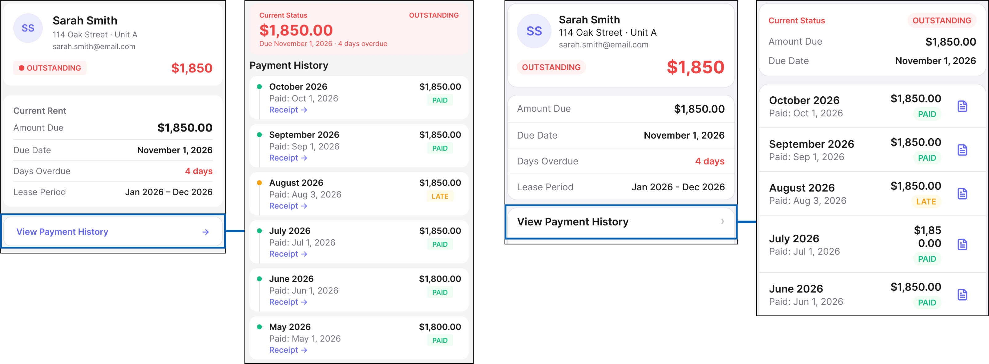
04
ACT
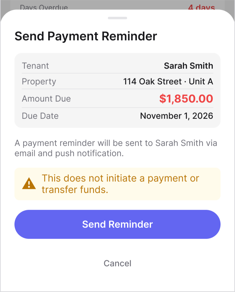
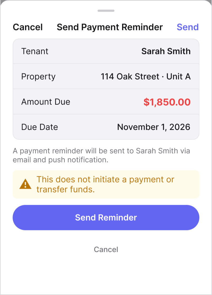
Open Send Payment Reminder and review the recipient, amount, and consequence before committing the action.
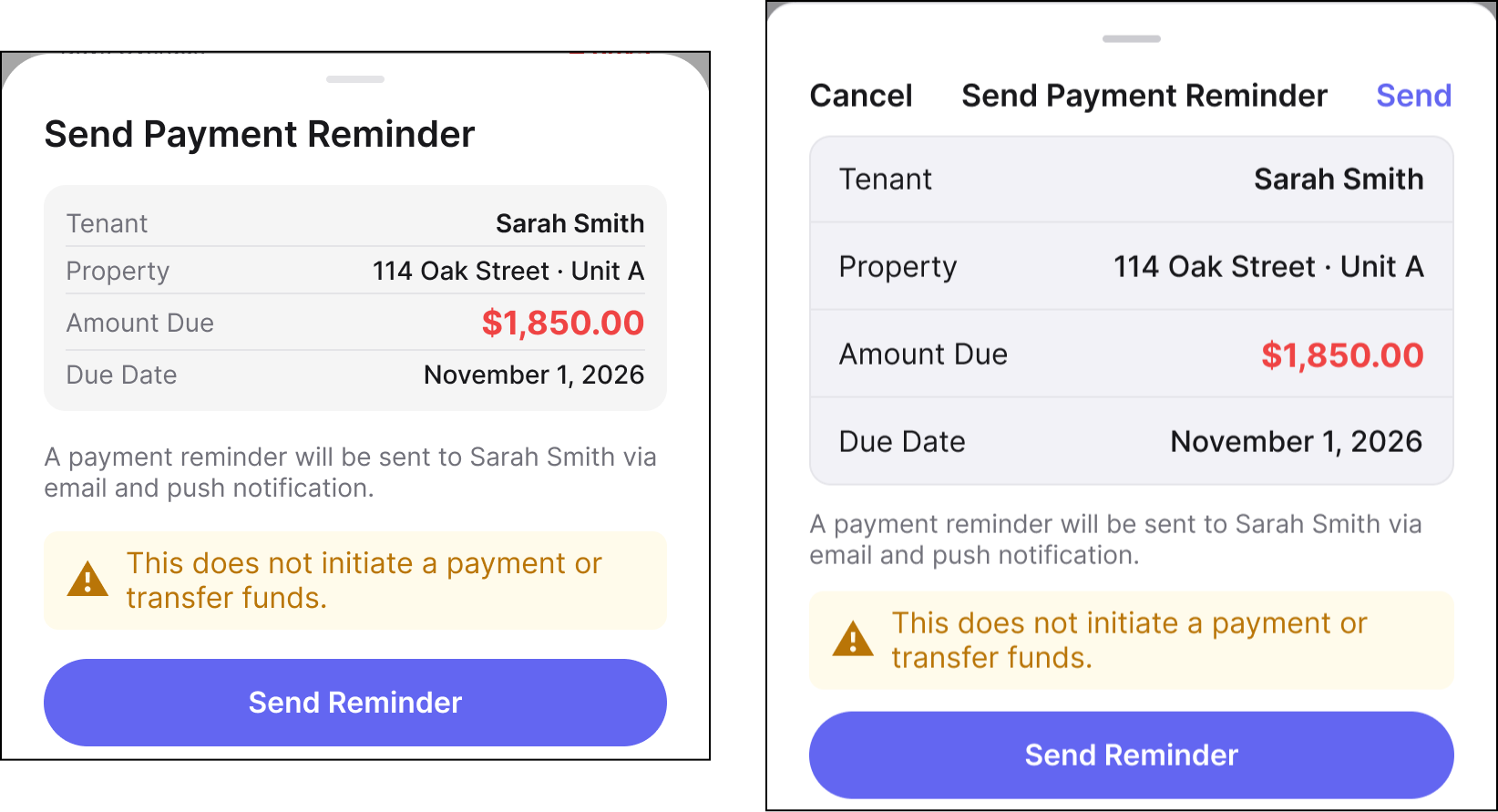
05
CONFIRM
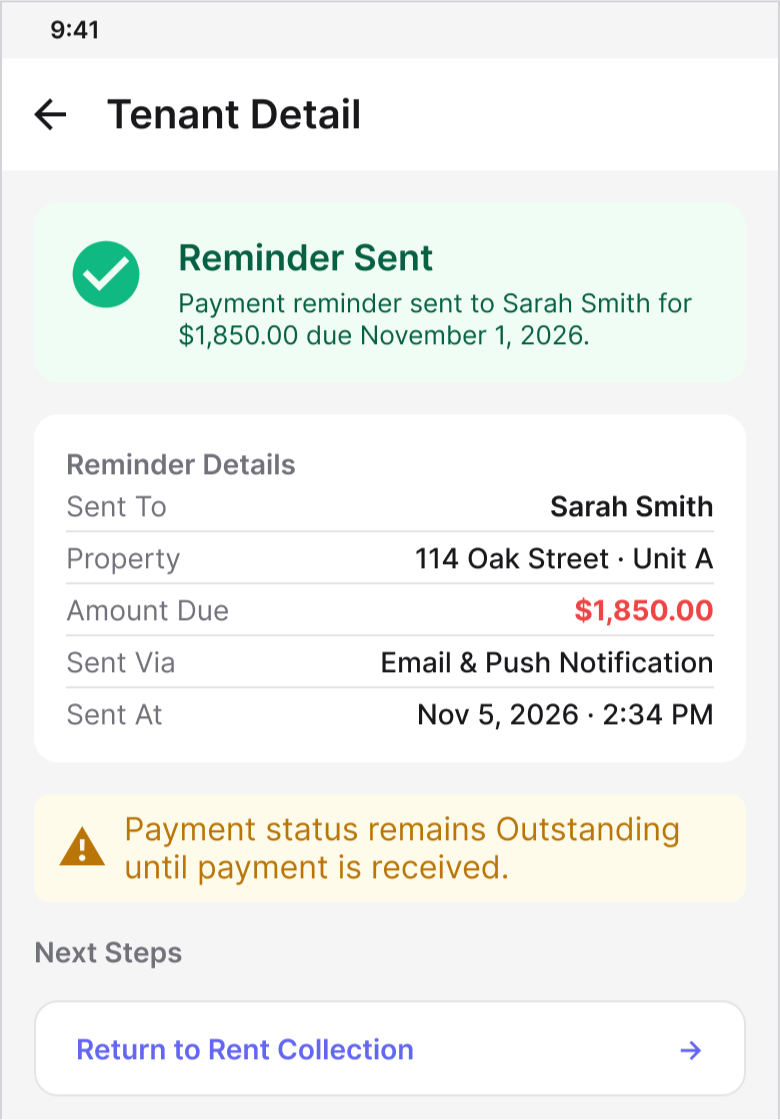
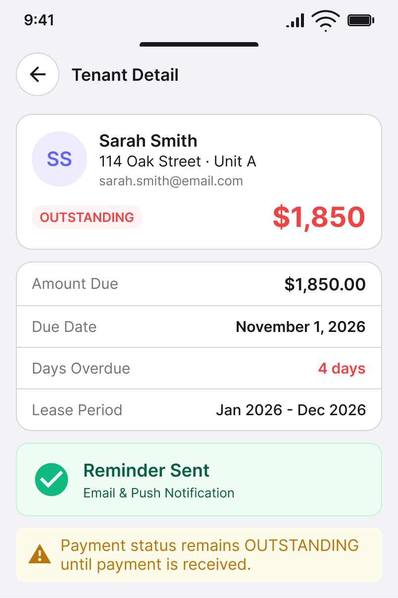
Send the reminder and receive clear confirmation that the action completed successfully.
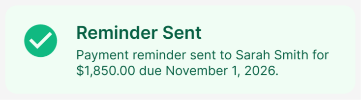
06
FOLLOW UP
Return to the updated tenant state and preserve the follow-up as part of the ongoing record.
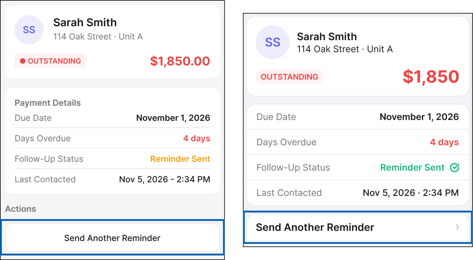
WORKFLOW PRINCIPLE
The platform can change how an interaction is expressed without changing where the user is in the business process.
The important cross-platform requirement is not pixel-level equivalence. It is preserving task order, financial meaning, state, and user context as the interface adapts to Android and iOS conventions.
08 / SHARED PRODUCT, NATIVE INTERACTION
The workflow stays shared. The interaction model adapts to the platform.
The same product decisions carry across Android and iOS, while navigation, temporary surfaces, selection, feedback, and return behavior follow the conventions users already know on each platform.
The shared layer defines task order, information meaning, state, and business rules. Android and iOS then express those requirements through the navigation, temporary surfaces, controls, feedback, and system behaviors users already understand on each platform.
01
PRIMARY NAVIGATION + HIERARCHY
Primary destinations and task hierarchy stay consistent while Android and iOS use their own native navigation structures and system behavior.
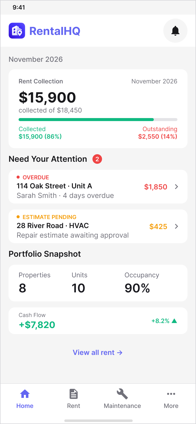
Material Design 3
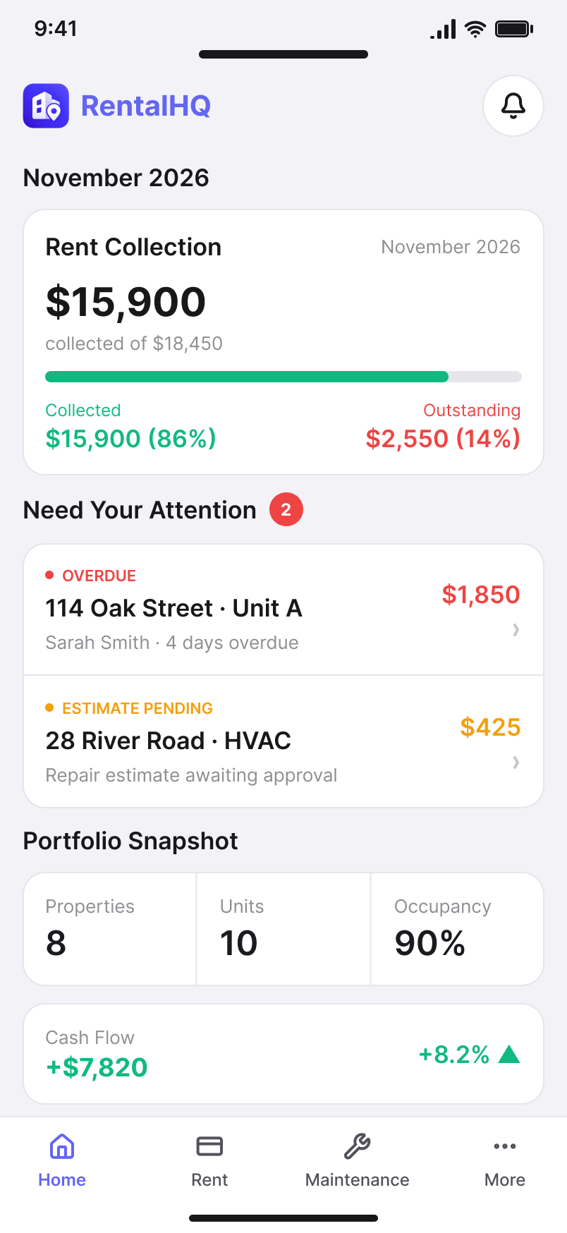
Apple Human Interface Guidelines
02
FILTER + SORT
Short-lived actions can use different native surfaces without changing the task itself — for example, platform-appropriate sheets, menus, or temporary panels.
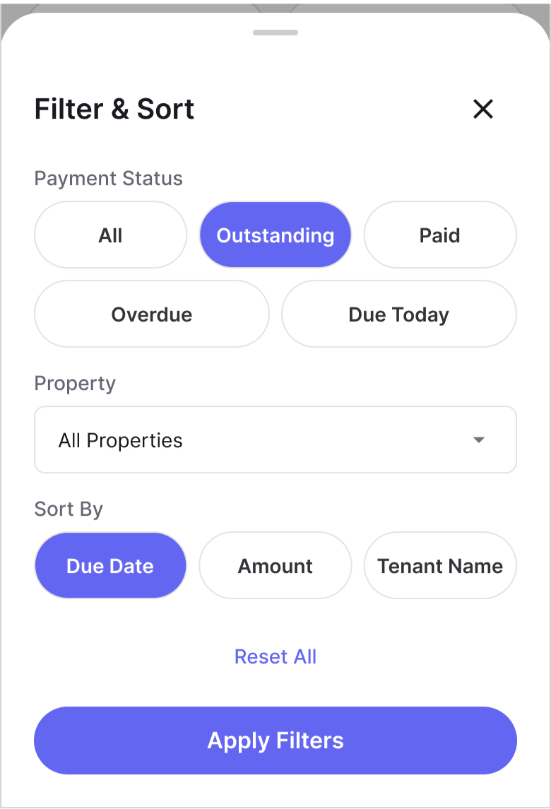
Material Design 3
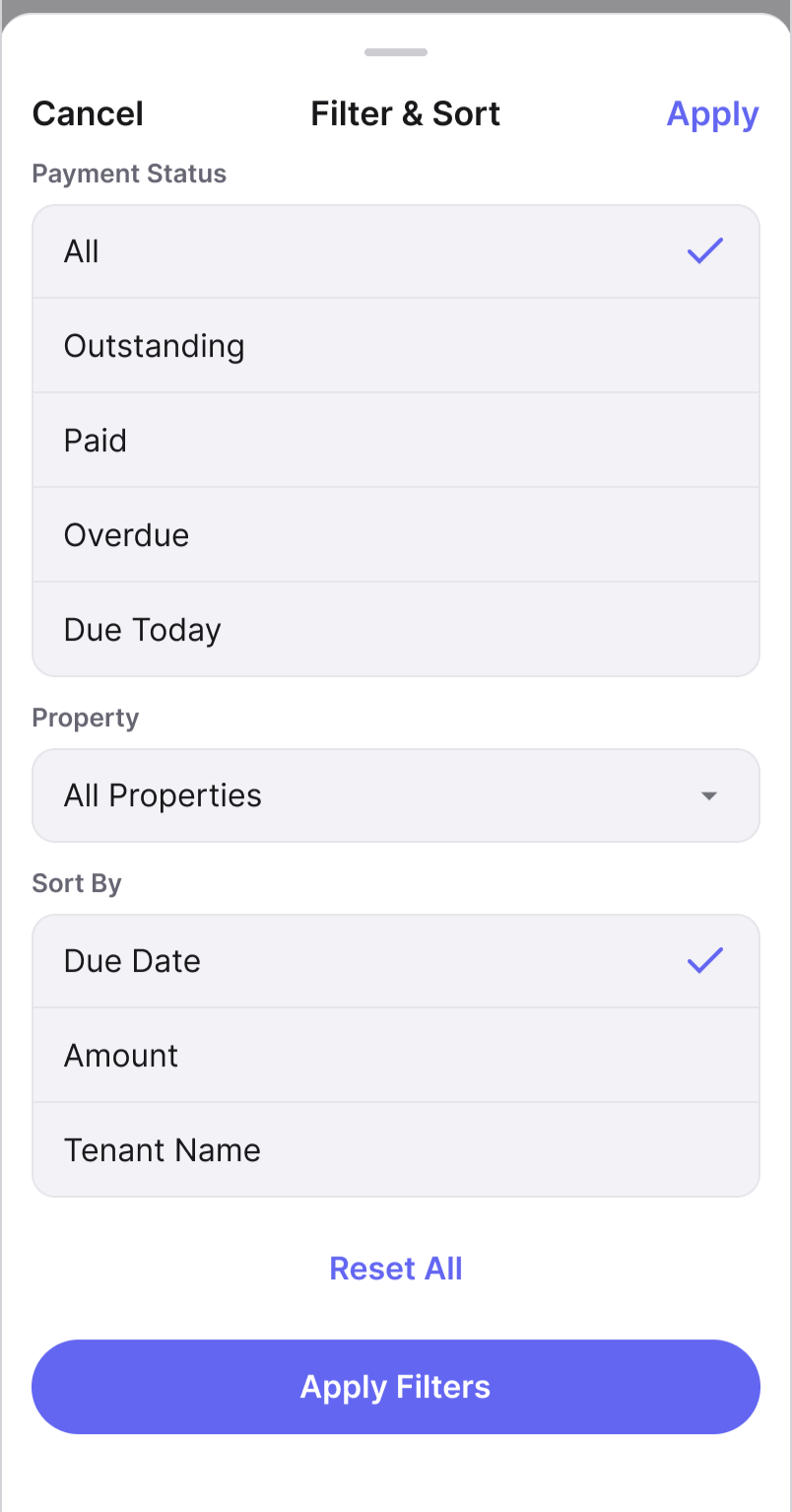
Apple Human Interface Guidelines
03
REMINDER + CONFIRMATION
Success, warning, confirmation, and recovery states preserve the same meaning while their presentation follows each platform’s native interaction conventions.
Material Design 3
Apple Human Interface Guidelines
04
NAVIGATION + RETURN
Navigation history, dismissal, and return behavior adapt to Android and iOS system expectations without breaking the user’s place in the workflow.
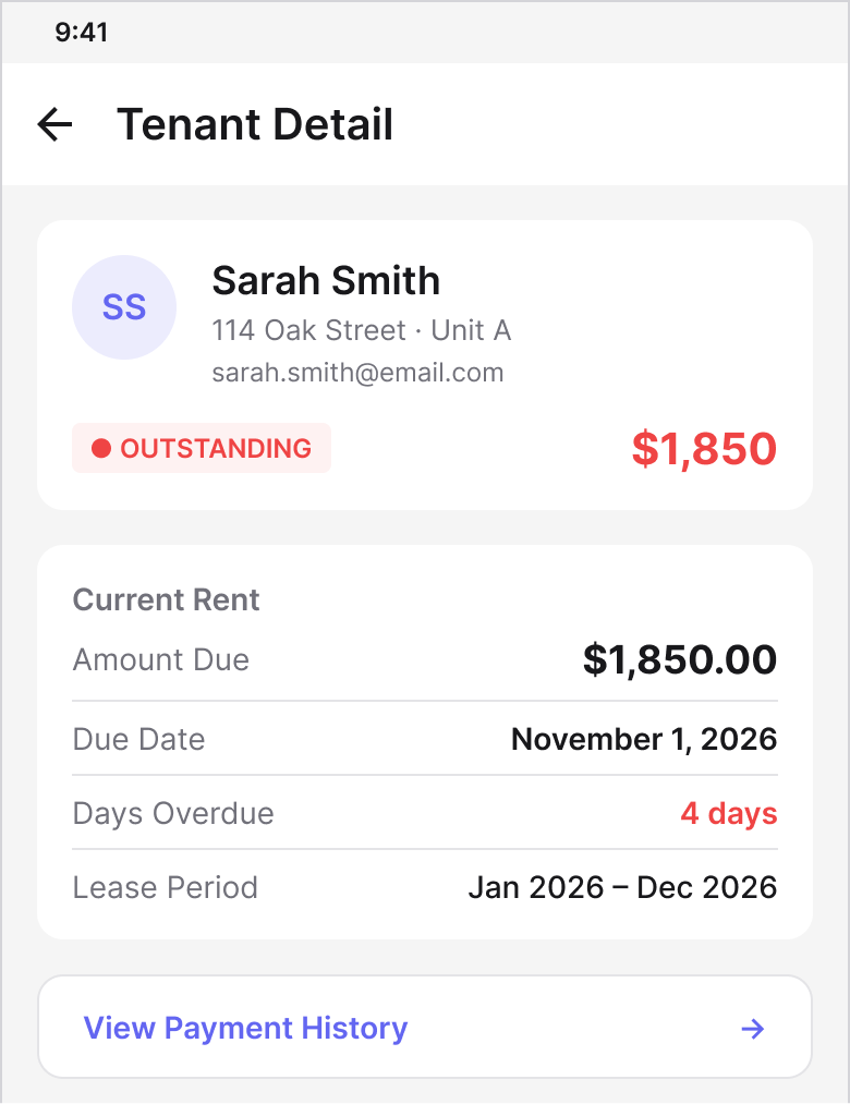
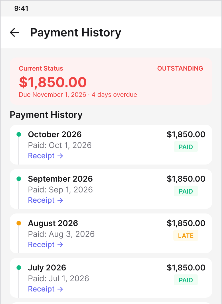
Material Design 3
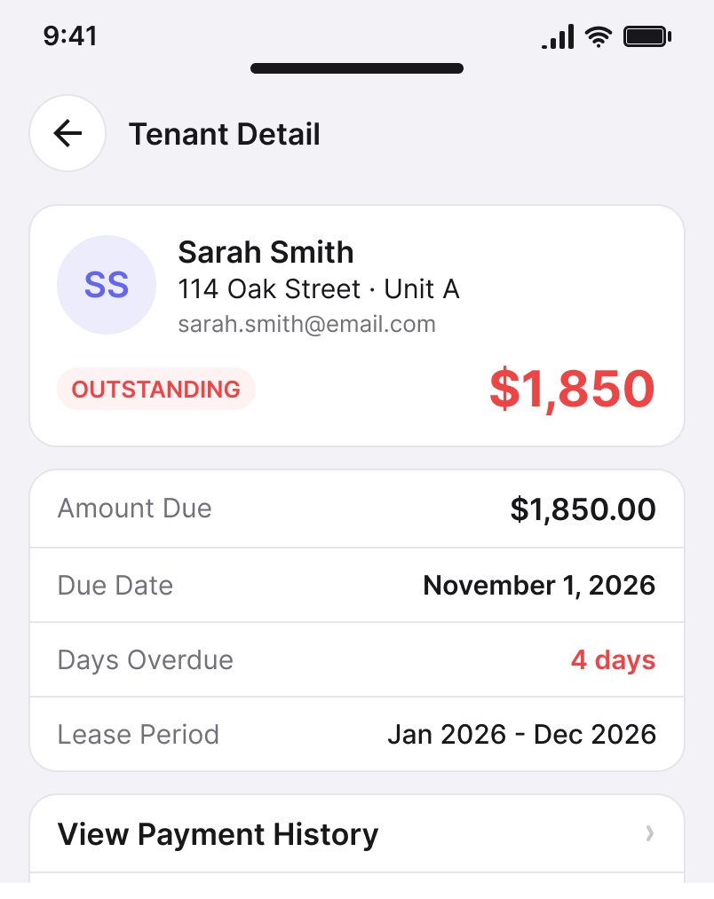
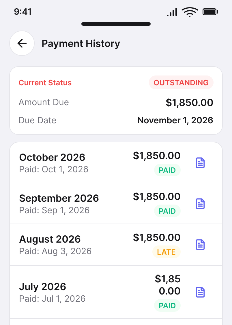
Apple Human Interface Guidelines
CROSS-PLATFORM RULE
Standardize the product decision first. Adapt the interaction pattern second.
09 / ADAPTIVE LAYOUTS
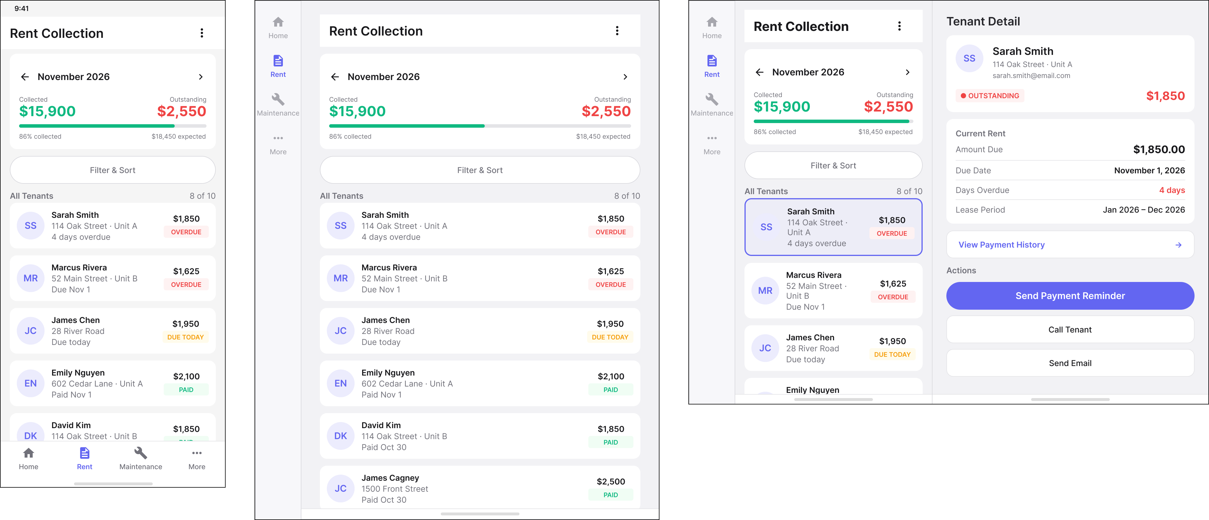
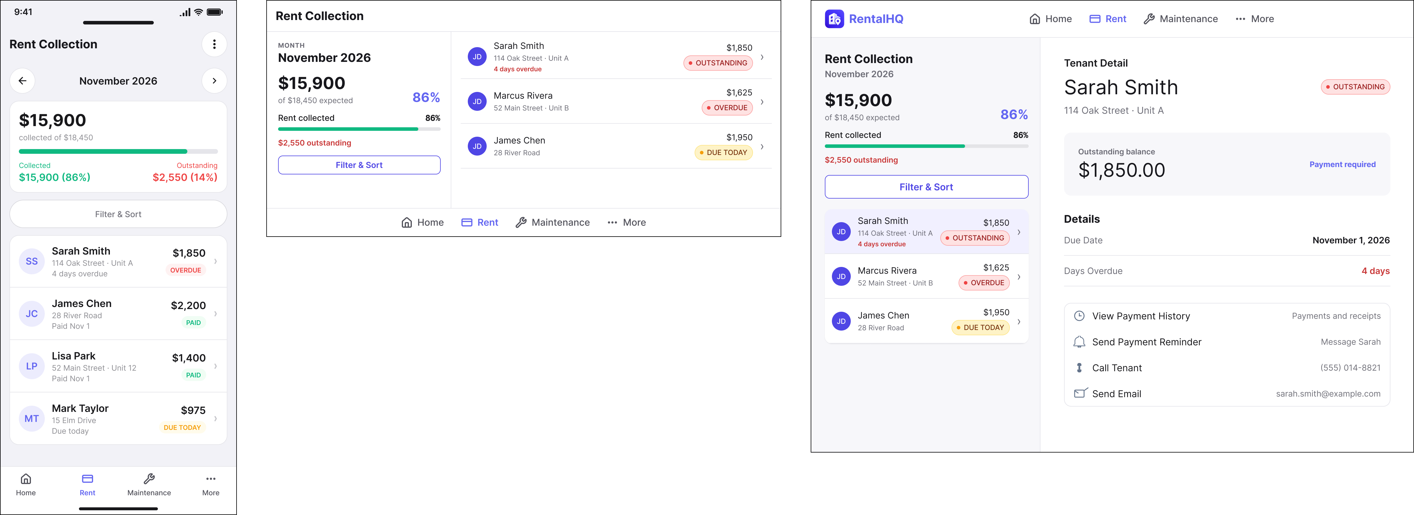
Adapt the layout without changing the task.
Responsive mobile design is not simply a larger or smaller version of the same screen.
As available space changes, information can move, expand, or become more visible — but priority, task state, and user context should remain intact.
ANDROID / WINDOW-SIZE CLASSES
IOS / IPADOS — SIZE CLASSES + TRAITS
PRIORITY
The most important information remains visually dominant.
CONTEXT
The active record and current task remain understandable as layout changes.
DENSITY
Additional space reveals useful information rather than adding decoration.
ACTION
Primary actions remain easy to locate across layout modes.
ADAPTIVE PRINCIPLE
Change density and composition without changing the user’s understanding of the task.
10 / MAINTENANCE + FINANCIAL IMPACT
Operational work becomes a financial decision.
For an independent landlord, maintenance is not isolated from financial management.
A repair request can become an estimate, an approval decision, an expense, and ultimately a change to cash flow. The mobile experience needs to preserve that connection without forcing the user through disconnected tools.
01 / ISSUE
Maintenance Financial Alert
Understand the maintenance problem, property context, urgency, and current state.
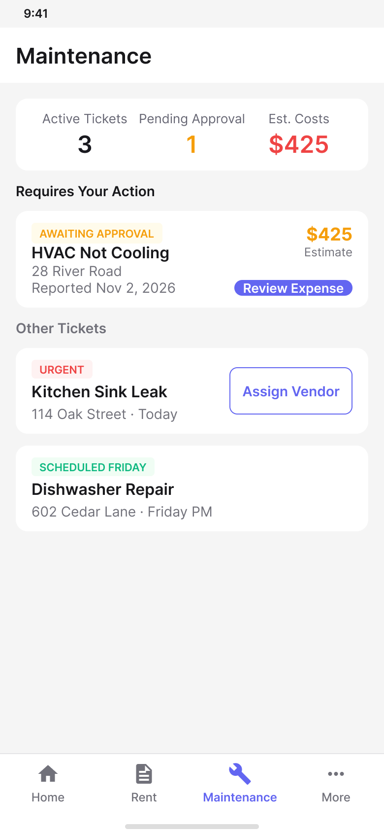
Material Design 3
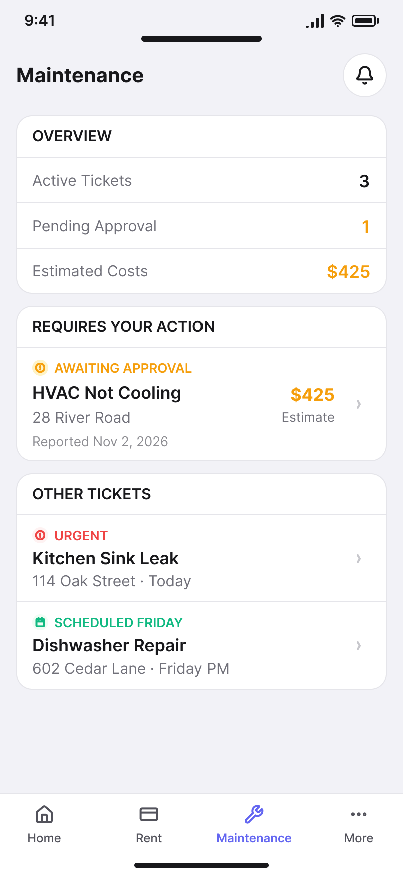
Apple Human Interface Guidelines
02 / ESTIMATE
Expense Review
Review the expected cost and the information needed to evaluate the request.
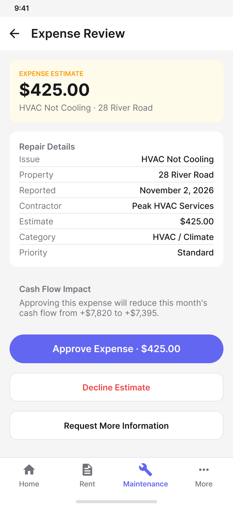
Material Design 3
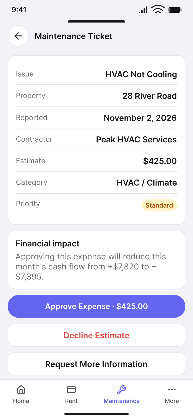
Apple Human Interface Guidelines
OPERATIONAL CONTEXT
Resolve the immediate issue.
The workflow needs enough property, tenant, vendor, status, and request context to support the maintenance decision.
FINANCIAL CONTEXT
Understand the consequence.
Cost and approval state remain connected to the landlord’s broader financial picture and available cash flow.
03 / DECISION
Expense Approval
Approve, reject, or continue the workflow with enough context to understand the consequence.
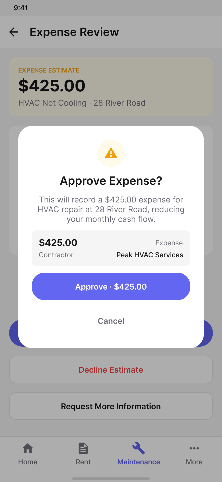
Material Design 3
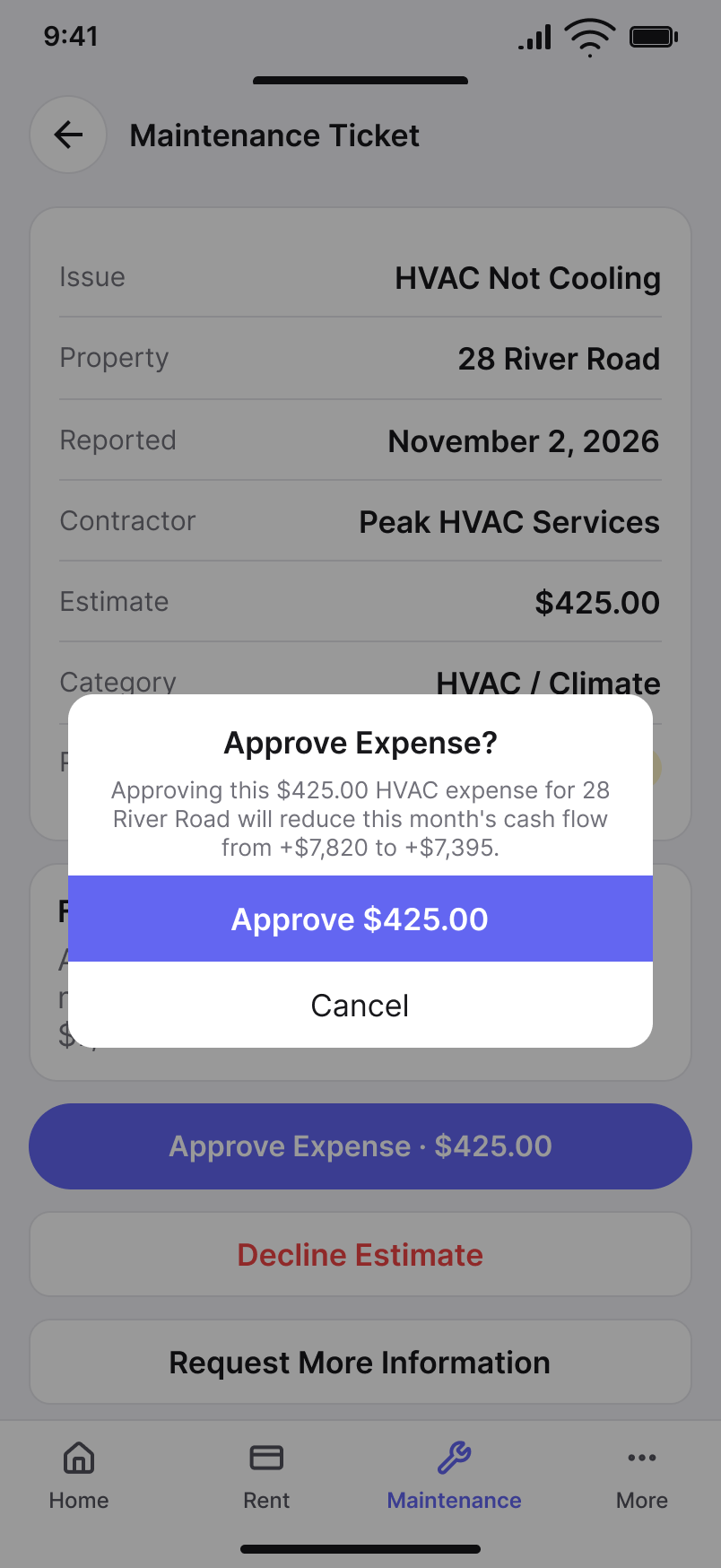
Apple Human Interface Guidelines
04 / FINANCIAL IMPACT
Cash Flow Impact
Carry the expense back into the broader financial picture rather than treating maintenance as an isolated task.
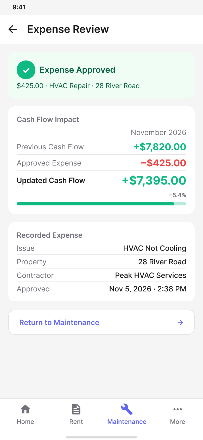
Material Design 3
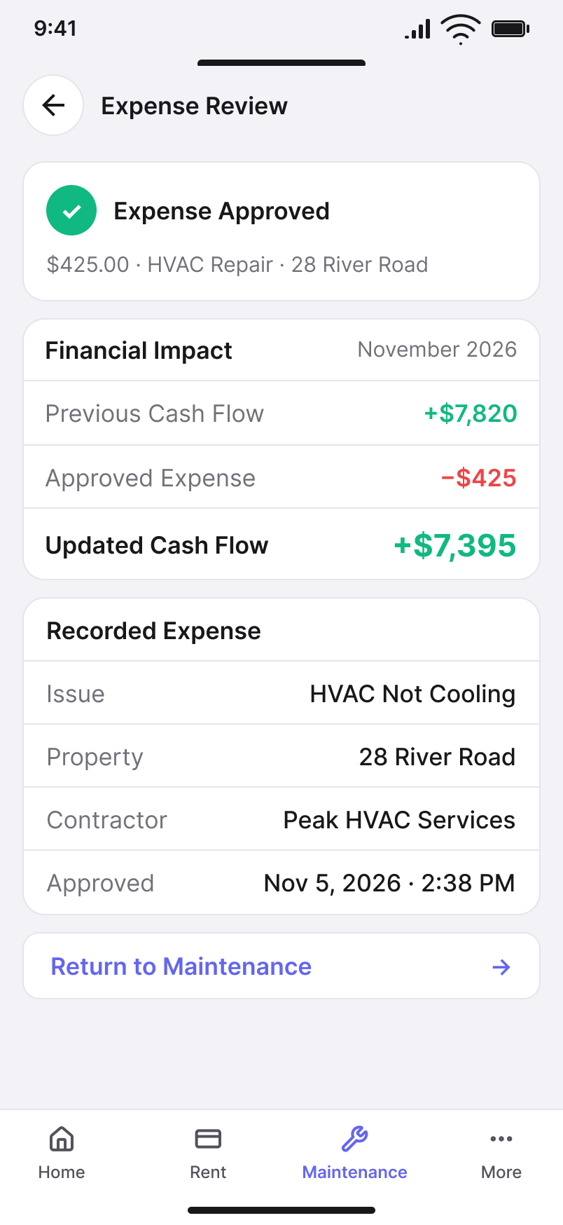
Apple Human Interface Guidelines
PRODUCT PRINCIPLE
Operational decisions are clearer when their financial consequences remain visible.
11 / STATES + ACCESSIBILITY
Design the states, trust, and accessibility — not just the happy path.
A usable mobile product has to remain understandable when data is loading, unavailable, incomplete, successful, blocked, or requires attention.
Accessibility is part of the same system: hierarchy, status, controls, typography, and feedback need to remain understandable across device, platform, and user needs.
01
LOADING
Maintain enough structure that users understand what is happening and what content is expected.
02
EMPTY
Explain the absence of data and provide a useful next action where one exists.
03
ERROR
State what failed, preserve recoverable context, and make recovery understandable.
04
SUCCESS
Confirm important actions clearly without interrupting the workflow more than necessary.
05
DISABLED + UNAVAILABLE
Differentiate unavailable actions from errors and make the reason understandable.
06
ATTENTION + WARNING
Use hierarchy, language, and more than color alone to communicate important state.
PLATFORM IMPLEMENTATION
Shared state meaning. Native accessibility behavior.
The product state model remains consistent across Android and iOS, while interaction targets, scalable type, screen-reader semantics, system feedback, and platform-specific behavior follow the conventions of each operating system.
ANDROID / MATERIAL DESIGN 3
- 48dp minimum interactive target strategy
- Scalable sp-based typography
- TalkBack-oriented semantic structure
- Loading, error, and feedback patterns aligned to Material behavior
- Status communicated through labels, icons, and hierarchy — not color alone
IOS / APPLE HUMAN INTERFACE GUIDELINES
- 44pt minimum interactive target strategy
- Dynamic Type-aware layouts
- VoiceOver-oriented semantic structure
- Safe-area and native system-feedback behavior
- Status communicated through labels, icons, and hierarchy — not color alone
TYPE
Layouts should remain usable as text size increases.
TARGETS
Interactive controls need appropriately usable touch targets.
CONTRAST
Text, controls, and status communication require clear visual contrast.
SEMANTICS
Meaningful labels and structure should support platform accessibility technologies.
NON-COLOR CUES
Critical status should not depend on color alone.
ACCESSIBILITY PRINCIPLE
Accessibility is not a separate mode. It is part of the product behavior that needs to survive every state.
12 / DESIGN + DEVELOPMENT
Define shared behavior before platform implementation.
Cross-platform design becomes easier to build when teams know which decisions are product rules and which decisions belong to the native platform.
The handoff therefore needs more than screens. It needs a clear behavioral contract: what must remain consistent, where Android and iOS should diverge, and how states and edge cases are expected to behave.
01
SHARED BEHAVIOR
Define task order, business rules, information meaning, and state before choosing platform components.
02
PLATFORM MAPPING
Map the shared requirement to the appropriate Material 3 or Apple HIG interaction pattern.
03
STATE + EDGE CASES
Document loading, validation, errors, confirmation, empty states, and recoverable interruption.
04
IMPLEMENTATION ALIGNMENT
Give development enough behavioral clarity to preserve product intent without requiring pixel-level duplication across platforms.
Material Design 3
Apple Human Interface Guidelines
DELIVERY PRINCIPLE
Consistency is easier to implement when teams align on behavior before aligning on components.
13 / WHAT CHANGED
What I’d carry forward.
The most important outcome of the mobile work is a repeatable model for designing one financial product across multiple native platforms.
These are design and product takeaways from the current direction — not post-launch performance claims.
01
FINANCIAL PRIORITY
Financial condition and urgent exceptions become easier to identify before deeper detail.
02
TASK CONTINUITY
Users can move from awareness to context, action, confirmation, and follow-up without losing the business thread.
03
SHARED PRODUCT LOGIC
Core information, workflow, state, and financial meaning remain aligned across Android and iOS.
04
NATIVE PLATFORM FIT
Navigation, controls, temporary surfaces, and system behavior can follow platform expectations without fragmenting the product.
05
ADAPTIVE RESILIENCE
The experience can change density and composition while preserving priority and context.
06
DESIGN + DEVELOPMENT CLARITY
A clearer separation between product behavior and platform expression creates a stronger implementation contract.
THE PRODUCT PRINCIPLE
The work demonstrates a cross-platform approach in which consistency is governed by product intent, state, and user understanding — while interaction, accessibility, and system behavior remain native to Android and iOS.